
Design Ideas
I instantly knew, that although open-ended, I am not going to spend a ton of time on finding the data because to me usability (of whatever data I choose) on phone layout was more important. And so, I chose a few #MakeoverMonday data sets to test device designer with because the datasets were readily available, but nothing seemed to work out.
I finally settled with ‘Volcanic Eruptions’ dataset that I had used in the past and quickly realized it was a perfect dataset to work with especially for a phone layout. The data was clean and precise. Something that can work well with mobile.
A few things that I had pre-planned before even settling with the dataset were:
- No tooltips
- No filters
- No parameters
The reason? Simple. Yes, that is it. I wanted a simplistic view of the volcanic eruptions data on mobile. Tapping data points to see tooltips on mobile takes space and makes the whole user experience very clunky.
Filters on mobile is something that I am not a fan of either. The volcanic eruptions dataset had years ranging from 1914 to 2015. That’s a lot of members of a dimension to have on a filter dropdown, that too on mobile.
Parameters didn’t make it to my dashboard for similar reasons explained above. Plus, they just weren’t needed for this dataset. Because the dataset was discrete, direct and not overloaded.
I spent a LOT of time trying to figure the right specifications for desktop and phone layouts. I tried creating a mobile dashboard first, but adapting the layout on desktop didn’t seem to work. So I started over and created a default/desktop layout first then added a phone layout. It was a lot of back and forth before I settled with adaptable and fitting fonts on both desktop and mobile layouts.
I wanted to go for a modern, sophisticated and an ‘app’ sort of a look and feel to my dashboard because that seemed fitting for it to be consumed on phones. So I used dark black ‘button’ like pane shading and thin bars to give it that ‘mobile’ fitting sophisticated look and feel. Orange seemed very lava-like and seemed appropriate for this dataset along with a no-brainer black background.
Usability
I started with 100% float (as most of my other public work). But quickly realized that dashboard consumption on different devices would mean different results and floating wouldn’t be the way to go for this round (this was painful for me). Because of scaling on different devices, my dashboard objects appeared at random pixels on devices I didn’t design the original dashboard for. So it only seemed feasible that I use a tile layout that scales and looks nice on any device regardless of landscape or portrait orientation.
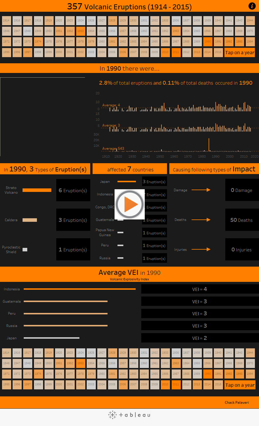
I used action filters to filter information of eruptions at a yearly level. I made it simple enough that a single tap on a year value unfolds the story in hopes to keep the dashboard lean and focused and to avoid too much tapping. A single tap on a year interaction on the filter sheet updated the bar charts below the filter control sheet to tell the number of eruptions that affected countries and the number of deaths that were caused. I used the text ‘Eruptions’, ‘Countries Affected’ and ‘Deaths’ within the labels on the bar chart, because that seemed like a nice and a smooth way to tell a story instead of having axis labels for ‘Eruptions’, ‘Countries Affected’ and ‘Deaths’ and just numbers as labels. The bar charts also seemed good to have to be able to better compare the selected year with other years for context. So it looks like this:

All the other worksheets are also controlled by the yearly filter sheet and provides context of eruptions within that year. I overlaid an empty text box on sheets that didn’t require additional user interactivity to prevent accidental tapping and zooming on worksheets while scrolling.
Lastly, I repeated the filter control sheet at the bottom of my dashboard to avoid sending the user at the top of the dashboard just to select another year. To maintain that seamlessness, I thought this was a necessary step.
Desktop layout isn’t way too different in content, just different in size specifications. Because the desktop layout is more stable and doesn’t require scaling on different devices I added an animated GIF showing yearly volcanic eruptions to add a little more interest and variety.
Lessons Learnt/Tips for Others
Some things I learnt along the way and a few tips that might help others:
- Don’t touch ‘device preview’ until you have finished designed your default layout. Because if you add images with URLs on your desktop layout at a later point, the images on your phone layout won’t be clickable because the URLs don’t carry forward on the phone layout. Also, all views present in default appearing as-is on a phone layout seemed better to me because removing objects from phone layout is easier than adding new ones
- Try to avoid floating too much on a phone layout. Different phones have different specifications. If you float a view and/or images on your phone layout on 320 px wide dashboard and if someone consumes the dashboard on a larger width device, objects shift and it is not a smooth user experience
- Tiling allows for better scaling across various dimensions and sizes of devices, leaving reasonable marginal empty spaces which seems alright to deal with
- Designing for the smallest width device (I designed for iPhone 5) means that the dashboard will look right on other devices because your content wouldn’t be cutoff. If you design for a mid to a larger phone device and if someone consumes the dashboard on a smaller device, content would be cut off. Props to Andy Kriebel for giving me this advice!
- Use worksheets as filters when possible, makes for a very smooth experience on phones and tablets
- Use empty text boxes over views that don’t need further user interaction. Saves some frustrations because your users wouldn’t accidentally click on or zoom in on a view if you have a text box over specific views. Also works great, if you don’t want tooltips on mobile but don’t mind having them on a desktop layout. Saves time by not having to create separate worksheets for different layouts. Assists with easier scrolling as well
- Use select highlight labels on views with the help of action filters, storytelling becomes easier
- Unless you are a JS API pro and have way better tricks to make things easily usable on mobile, repeat filter control sheets at the bottom most part of the dashboard. This adds a seamless user experience, where in a user doesn’t have to scroll all the way up to the top just to select another member of a dimension
I hope you found the design process and tips helpful. Big thanks to so many folks who helped me with their valuable feedback. Adam Crahen, Curtis Harris, Matt Francis and Josh Tapley; thank you all. I appreciate all your time to help me out with this!
Now that the feeder competition of #IronViz is in its final phase, Tableau Conference 2016 seems very close. I am looking forward to meet this amazingly vibrant community. Let the countdown begin!!!
As always, thank you for taking the time to read. If you have any comments/feedback, I would love to hear from you!

Recent Comments