Funnel Chart - step by step
Quote from Guest on March 10, 2017, 12:04 amChart 1
Chart 2 :
Step by step
Option 1: The Step Dimension
Going into this project, I knew that I wanted the main view to be a funnel chart. For this reason, I was able to plan ahead and put the data in an optimal format for Tableau. Here is a sample of the underlying data:
Gender Step Players Female 1 371,393 Female 2 35,490 Female 3 36 Male 1 412,351 Male 2 36,741 Male 3 77 Note that there is a dimension of “Step”, which is just an arbitrary, intuitive name for each of the three levels of high school, college, and pro. The measure is then the corresponding number of players that reached each step. This is the easiest way to build a funnel chart; here are the steps:
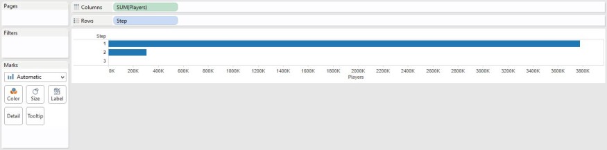
1. Create a horizontal bar chart by dragging your step dimension onto the rows shelf and your players measure to the rows shelf.
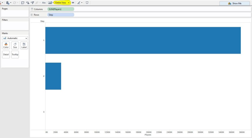
2. To get a full sense of the funnel, change the fit of your worksheet from ‘Normal’ to ‘Entire View’
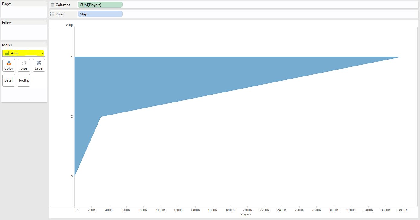
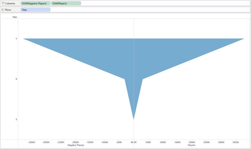
3. Step three is where the magic happens. Simply change the mark type from ‘Automatic’ (which is currently ‘Bar’) to ‘Area’. You are left with the right side of the funnel.
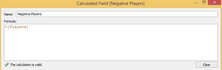
4. If your data is in a format outlined in the table above, there is a simple solution to mirroring the right side of the funnel onto the left side. To do this, you will create a calculated field by right-clicking on the ‘Players’ measure and selecting ‘Create Calculated Field’. Name your calculated field ‘Negative Players’ and add a ‘-‘ in front of ‘[Players]’. Your entire formula will look like this:
5. The final step in creating a symmetrical funnel chart is to drag and drop your new ‘Negative Players’ measure in front of the ‘Players’ measure on the columns shelf.
From here, your beautiful funnel chart can be used like any other chart in Tableau. Encode it by color (in my case, its colored by gender), add quick filters, and add tooltips / labels / annotations to make the data in the chart clear to the end user.
Option 2: Separate Measures
It is likely that your corporate data is not in the layout of the table above by default, and you may not be in a position to easily change this on your own. This solution is not as flexible or optimal for Tableau, but it is functional. Let’s assume that instead of the layout in the table above, your data looks more like this, with each ‘Players’ measure broken out by level, causing your layout to be more horizontal instead of vertical:
Gender Step 1 Players Step 2 Players Step 3 Players Female 371,393 35,490 36 Male 412,351 36,741 77 In this case, because you no longer have a dimension of step, the approach is slightly different:
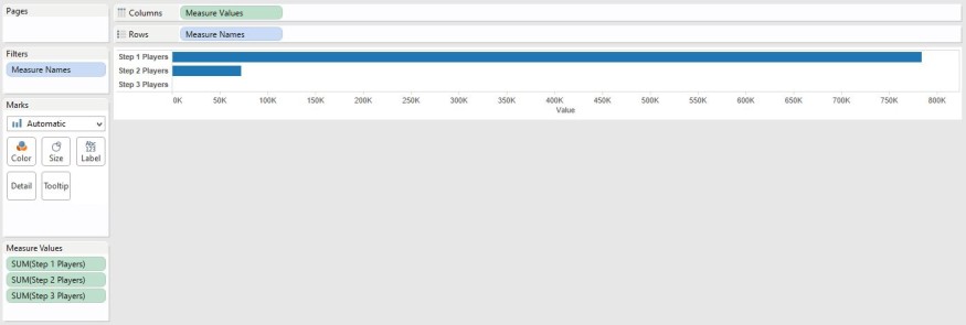
1. To create the right side of the funnel, you will need to add the measures to the view individually. The easiest way to do this is to double click each of your three measures (Step 1 Players, Step 2 Players, and Step 3 Players) to add them to the view. Double-clicking each measure will create a small multiples chart, so you will have to use the ‘Show Me’ button to change the chart type to a bar chart. While the set-up is different, you should now see the beginnings of the right side of your funnel, just like in step one from the first approach above:
2. Follow Step 2 from the first approach, changing the fit from ‘Normal’ to ‘Entire View’.
3. Follow Step 3 from the first approach, changing your mark type from ‘Automatic’ to ‘Area’.
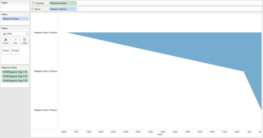
4. Step 4 on the second approach is where things get tricky. The first thing you need to do is create a negative version of each of your three measures, much like creating a negative version of the ‘Players’ measure in step four from the first approach. Once you have three new calculated fields, one negative version for each of your three measures (i.e. Negative Step 1 Players, Negative Step 2 Players, and Negative Step 3 Players), open a new workbook sheet and follow steps 1-3 above – this time using your newly created negative versions of each measure. You should end up with the left side of your funnel:
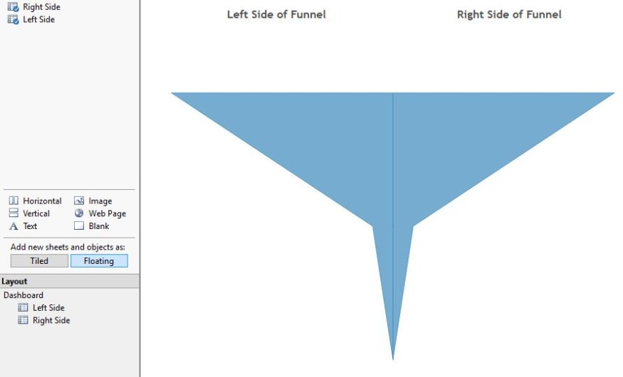
5. The final step to this approach is joining the left and right side of your funnel. This can be accomplished by floating each sheet on a dashboard and lining them up:
Chart 1

Chart 2 :
Step by step
Option 1: The Step Dimension
Going into this project, I knew that I wanted the main view to be a funnel chart. For this reason, I was able to plan ahead and put the data in an optimal format for Tableau. Here is a sample of the underlying data:
| Gender | Step | Players |
| Female | 1 | 371,393 |
| Female | 2 | 35,490 |
| Female | 3 | 36 |
| Male | 1 | 412,351 |
| Male | 2 | 36,741 |
| Male | 3 | 77 |
Note that there is a dimension of “Step”, which is just an arbitrary, intuitive name for each of the three levels of high school, college, and pro. The measure is then the corresponding number of players that reached each step. This is the easiest way to build a funnel chart; here are the steps:
1. Create a horizontal bar chart by dragging your step dimension onto the rows shelf and your players measure to the rows shelf.
2. To get a full sense of the funnel, change the fit of your worksheet from ‘Normal’ to ‘Entire View’
3. Step three is where the magic happens. Simply change the mark type from ‘Automatic’ (which is currently ‘Bar’) to ‘Area’. You are left with the right side of the funnel.
4. If your data is in a format outlined in the table above, there is a simple solution to mirroring the right side of the funnel onto the left side. To do this, you will create a calculated field by right-clicking on the ‘Players’ measure and selecting ‘Create Calculated Field’. Name your calculated field ‘Negative Players’ and add a ‘-‘ in front of ‘[Players]’. Your entire formula will look like this:
5. The final step in creating a symmetrical funnel chart is to drag and drop your new ‘Negative Players’ measure in front of the ‘Players’ measure on the columns shelf.
From here, your beautiful funnel chart can be used like any other chart in Tableau. Encode it by color (in my case, its colored by gender), add quick filters, and add tooltips / labels / annotations to make the data in the chart clear to the end user.
Option 2: Separate Measures
It is likely that your corporate data is not in the layout of the table above by default, and you may not be in a position to easily change this on your own. This solution is not as flexible or optimal for Tableau, but it is functional. Let’s assume that instead of the layout in the table above, your data looks more like this, with each ‘Players’ measure broken out by level, causing your layout to be more horizontal instead of vertical:
| Gender | Step 1 Players | Step 2 Players | Step 3 Players |
| Female | 371,393 | 35,490 | 36 |
| Male | 412,351 | 36,741 | 77 |
In this case, because you no longer have a dimension of step, the approach is slightly different:
1. To create the right side of the funnel, you will need to add the measures to the view individually. The easiest way to do this is to double click each of your three measures (Step 1 Players, Step 2 Players, and Step 3 Players) to add them to the view. Double-clicking each measure will create a small multiples chart, so you will have to use the ‘Show Me’ button to change the chart type to a bar chart. While the set-up is different, you should now see the beginnings of the right side of your funnel, just like in step one from the first approach above:
2. Follow Step 2 from the first approach, changing the fit from ‘Normal’ to ‘Entire View’.
3. Follow Step 3 from the first approach, changing your mark type from ‘Automatic’ to ‘Area’.
4. Step 4 on the second approach is where things get tricky. The first thing you need to do is create a negative version of each of your three measures, much like creating a negative version of the ‘Players’ measure in step four from the first approach. Once you have three new calculated fields, one negative version for each of your three measures (i.e. Negative Step 1 Players, Negative Step 2 Players, and Negative Step 3 Players), open a new workbook sheet and follow steps 1-3 above – this time using your newly created negative versions of each measure. You should end up with the left side of your funnel:
5. The final step to this approach is joining the left and right side of your funnel. This can be accomplished by floating each sheet on a dashboard and lining them up: